
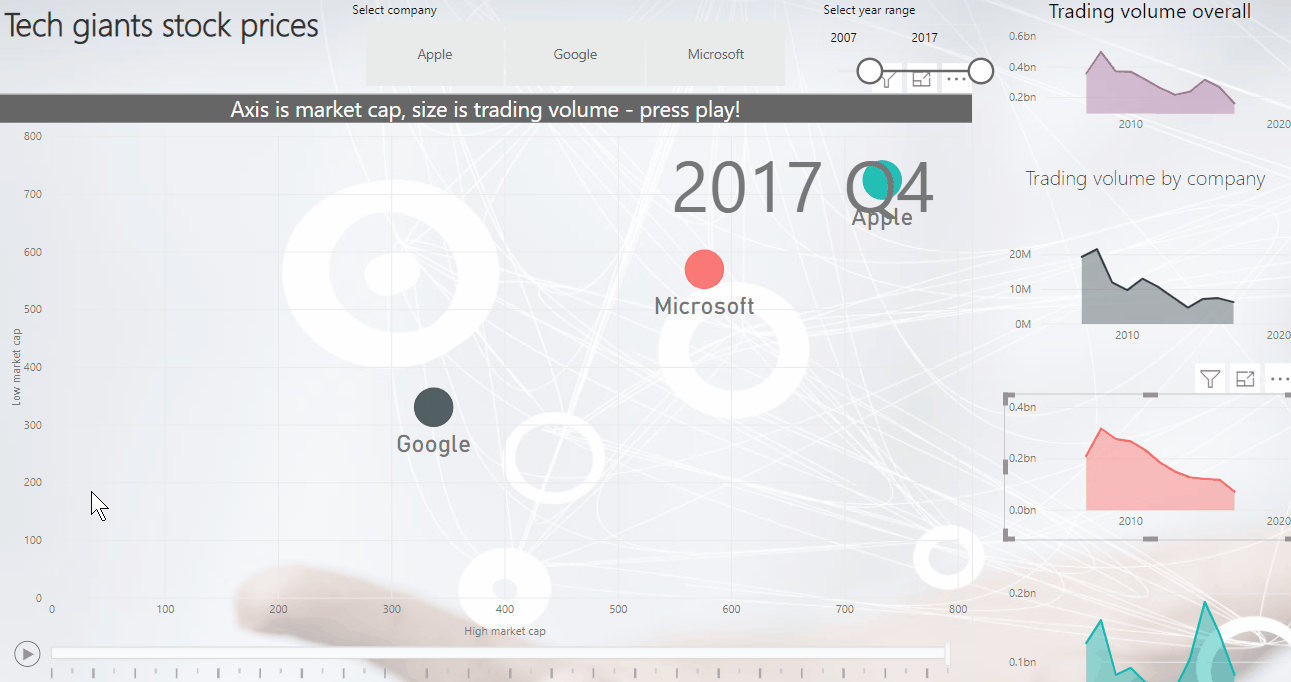
Interactive Dashboard of tech giants' stocks
Click the play button on the chart to see it play the story over time. Click here for mobile view
|
This was created using Microsoft PowerBI, a great application that allows to bring in different data from many sources, link them together & create modern interactive dashboards!
Note that the data is approximations (market cap is calculated as share price high/low taken on the first day of each quarter multiplied by number of shares in issue on 10 December 2018. |